Integrating UX Research and Design: A Case study on Veterinary Clinic Insurance claims in the UK.
Co-written with principal product designer Hesam Khodabakshi
Introduction
UX research and design riding off into the sunset together. Is it possible? Or should we just remain in our own little castles, doing our own thing and hope that someday our letters would arrive on the other side? Me, and principal product designer, Hesam Khodabakshi, decided it was time for research and design to close that gap and work on in-time research for the betterment of design.
A recent project we did, as colleagues at Nordhealth, was centered around the redesign of the insurance claim workflow for Provet Cloud. This project wasn’t just another task; it was a unique challenge that stood out in its complexity and scope. Tasked with redesigning a system to meet the specific needs of our UK clients, while maintaining functionality for our diverse international user base, we faced a puzzle that extended beyond geographical borders. The goal here was to create a singular, cohesive design that catered to varying market requirements, from the Nordics to the Mediterranean, and the US.
Although insurance claim processes do not sound exciting at all, we were both immediately excited about this project from the get-go. As a UX researcher and a designer typically engaged in high-level strategy and process optimization, collaborating directly on a project was a rare and exciting opportunity for the both of us. This project was not just about meeting deadlines; it was about delving deep into the unknowns of our user’s needs, challenging the many assumptions provided to us by stakeholders, and uncovering the facts that would guide our design decisions.
Our collaboration was that of seamless integration, where research findings flowed directly into design iterations. In a shared Figma file, each discovery found it’s place, evolving from abstract data, into tangible design elements. Regular meetings with stakeholders became milestones, where our evolving insights and design prototypes were showcased, ensuring everyone involved had a clear understanding of the direction and rationale behind each decision.
This article is more than just a recount of a project; it’s a testament to the power of collaboration between UX Research and Design. The narrative of our project serves as a backdrop to the real story we want to tell – a story about breaking the myth that research is a solitary journey. We want to demonstrate that research can be agile, collaborative and integral to the design process. Our journey is a blueprint for how researchers and designers can work in tandem, turning insights into actions swiftly and effectively. We hope that by sharing our experience, we can inspire other UX professionals to embrace this collaborative approach, enhancing the impact and efficiency of their work.
Background
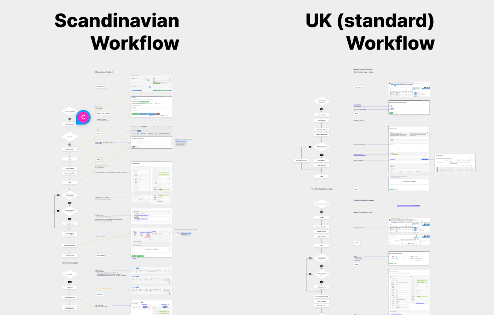
Provet Cloud, a veterinary SaaS, has been pivotal in enhancing the operations of veterinary clinics globally. Its functionalities range from consultation management to financial transactions, including the insurance claim process. Initially designed for the Nordic market, Provet Cloud’s insurance workflow faced challenges in meeting the unique requirements of the UK market, as revealed by user and customer success manager feedback.
A key issue was the mismatch of insurance claim types in Provet Cloud for UK clients, indicating a gap in understanding the UK’s veterinary insurance claim workflow. Unlike the Nordics, where clinic personnel handle claims, the UK often relies on external financial hires to process claims in batches, complicating the workflow and increasing costs for clinics.
Addressing these challenges within a three-month deadline required a strategic approach. Our project team, including a project manager, ex-veterinary personnel, and research and design experts, focused on understanding and integrating the UK market’s needs. The project manager was crucial in collecting feedback and scoping the project, ensuring that essential redesign aspects were prioritized for development.
Methodology
Research approach
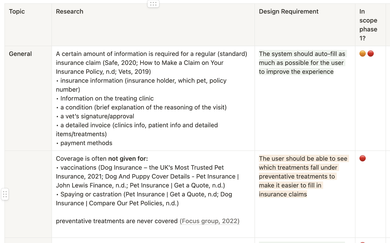
Our journey into redesigning the insurance claim workflow for Provet Cloud began with a comprehensive literature review. This initial phase was crucial in understanding the regulatory landscape and market needs specific to veterinary insurance claims in the UK. Scouring government websites and pet insurance portals, I compiled a robust document detailing the nuances of UK insurance regulations, which became the cornerstone of our research.
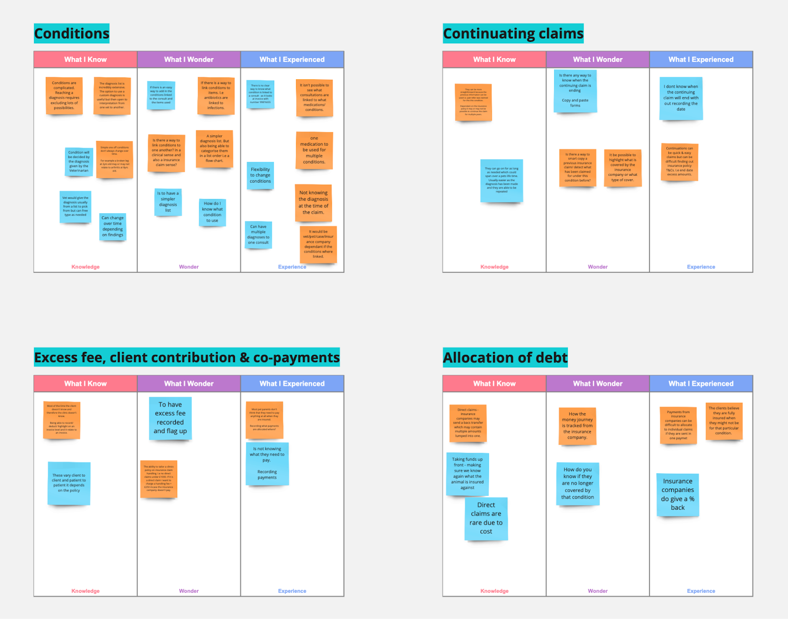
Following the literature review, we employed the knowledge, wonder, experience (KWE) framework with our internal veterinary experts, who had previously worked in the UK veterinary sector. This approach was instrumental in tapping into their rich experience, helping us to identify knowledge gaps, questions and real-world experiences related to insurance claims. The insights gained here were not only enlightening but also guides us back to the literature for further exploration, ensuring the research was grounded in both theory and practice.
A critical component of our research was the comparative analysis of the existing Provet Cloud insurance workflow, primarily designed for the Nordic market, against the newly identified UK requirements. This involved a collaborative process with Hesam, the principal product designer, where we meticulously mapped out the current system’s features against the UK market’s needs. Our goal was to identify gaps and opportunities to create a workflow that would seamlessly cater to both markets. This comparative analysis was vital in bridging the gap between the existing system and the new design requirements.
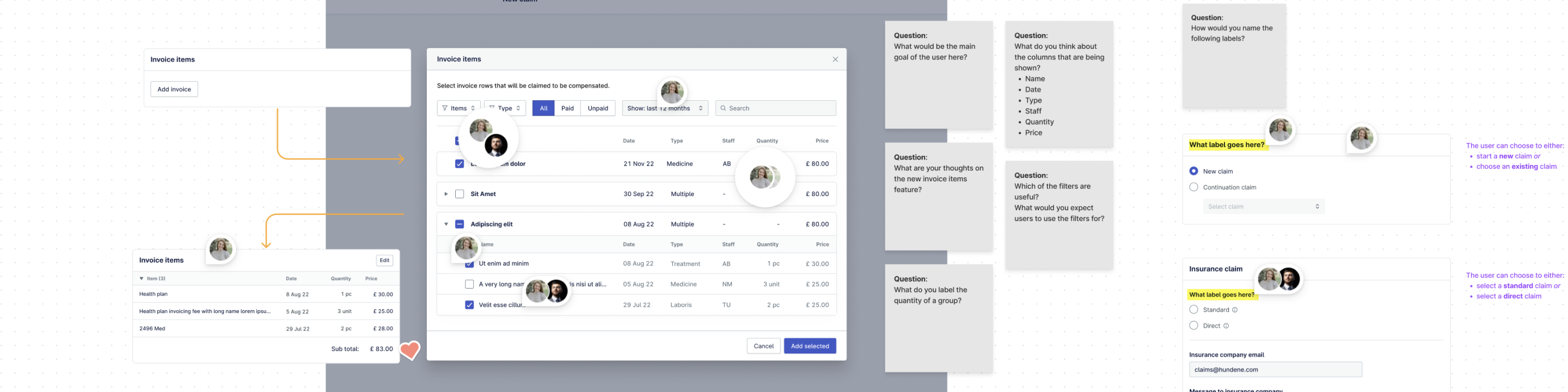
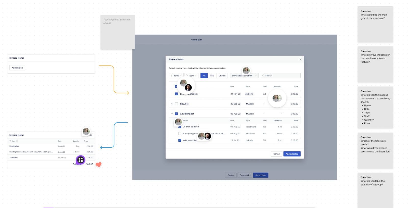
The next step was the stakeholder walkthroughs. These sessions, led by Hesam, the principal product designer, and structured by me, were designed to test the evolving design concepts with our internal experts and UK users. Utilizing a Figma file as our interactive canvas, we engaged stakeholders in a dynamic review process. Their feedback, thoughts, and reactions were meticulously recorded and analysed, both in real-time on Figma, and post-session using Dovetail. This dual approach to data collection and analysis allowed for rapid iteration and refinement of our design concepts.
Throughout the project, our research methodology evolves. We initially planned to conduct a ‘Jobs to be Done’ analysis but decided to forego it. The combination of literature review and stakeholder walkthroughs was providing us with rich, actionable data, making the additional method redundant. Moreover, time constraints necessitated a focused approach.
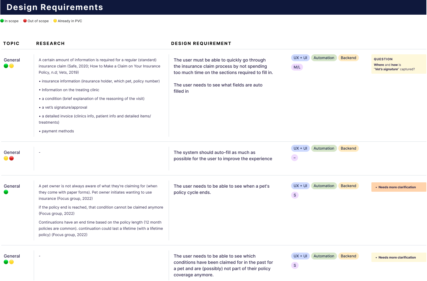
To manage the wealth of insights and prioritize them effectively, we maintained a scope document in collaboration with our project manager. This living document helped us navigate the large amounts of information and ensured that our design iterations were aligned with the most pressing needs and project goals.
In summary, the research approach was a blend of theoretical exploration and practical user-centered testing. It was an iterative process, adapting to the project’s needs and constraints, and was pivotal in shaping a design that was not only user-centric but also responsive to the unique challenges of the UK market.
Design Approach
The initial design concept was a blend of research findings, UX design principles, and feedback from stakeholders, focusing on addressing ongoing issues and concerns. Guided by Odette insights, we prioritized these findings into high-impact opportunities, quick wins, and elements that were unfeasible within our time or technical constraints.
Prototyping and Testing
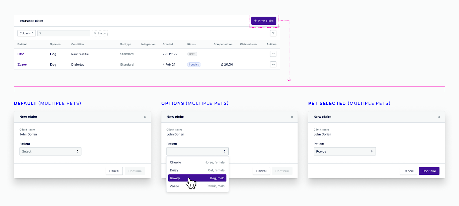
We developed a prototype simulating the user journey of initiating an insurance claim, meticulously representing various states and scenarios encountered during this process. Our objective was to immerse stakeholders in the experience of filing a new claim, enabling us to:
- Validate our design proposals with input from veterinarians experienced in the UK insurance market.
- Identify any gaps or flaws that weren’t apparent during the initial research and design phases.
- Uncover any unforeseen challenges.
Odette and I meticulously documented all feedback through video recordings and notes, enriching our design considerations. We also granted stakeholders file access for further review and comments, ensuring comprehensive engagement.
Revisiting stakeholder feedback, we aligned it with our original findings before refining the design. The predominant feedback highlighted the intricacies of insurance form completion and the diverse interactions between clinics and insurance providers. This insight was instrumental in enhancing our design, ensuring the Provet insurance flow facilitates rather than hinders the task at hand.
Leveraging Odette’s expertise in interpreting research and feedback, combined with my UX and UI design skills, we crafted a user-friendly experience that garnered positive feedback from our target audience.
Key design challenges stemmed from the complexities of the UK insurance system, legal constraints on clinics and software, and the variability in how clinics and insurers manage outstanding payments.
Picking the Final Design Direction
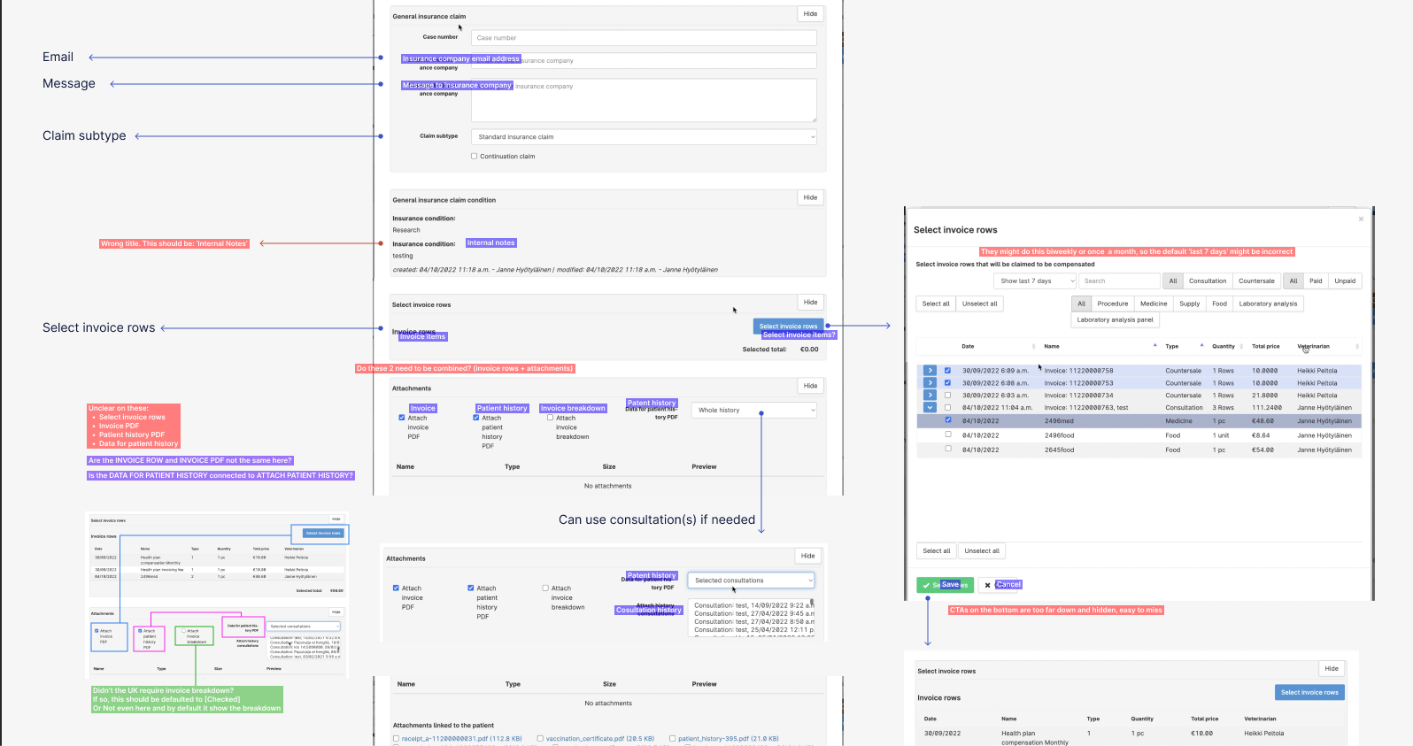
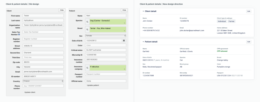
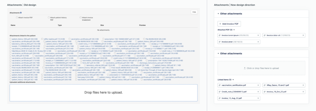
Drawing from the established UX/UI best practices and the Nielsen Norman Group’s 10 Usability Heuristics for UI Design, we strategically chose a design direction tailored for the UK insurance claim market. This revamped design significantly elevates the user experience. Key improvements include an optimized information flow for enhanced readability and user engagement, distinct indicators for required fields and missing data, refined UX copy for clearer and more direct communication, and an orderly step-by-step form to maximize usability.
A pivotal aspect of our design approach was the integration of automation. Clinical staff can review and modify any automated inputs and selections, which not only diminishes the likelihood of user errors but also reduces the time needed to complete the insurance form.
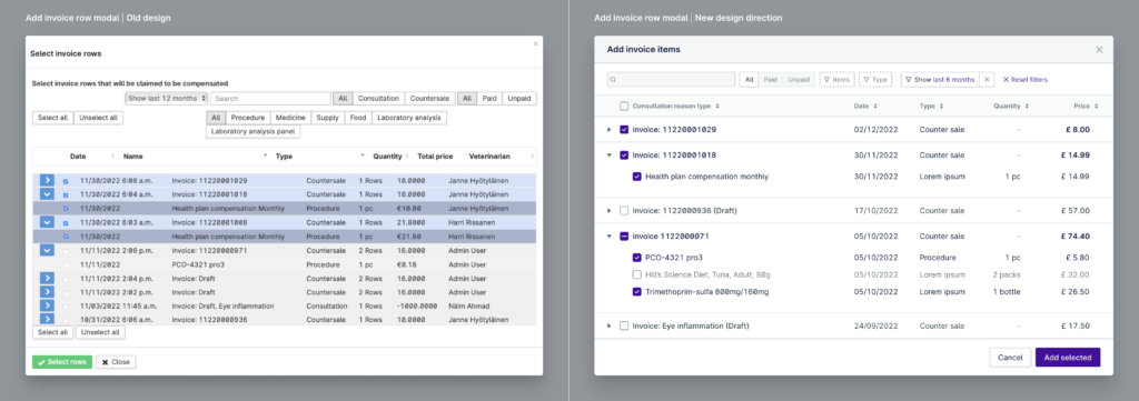
To further refine the user experience, we focused on minimizing visual clutter in the user interface. This cleaner, more focused design helps users focus on the task at hand, thereby reducing cognitive load. We utilized design elements such as strategic color use, clear section breaks and divisions, and a well-defined hierarchy. These features not only draw the user’s attention to the most crucial information but also seamlessly guide them through the insurance claim process.
Collaboration in action
Our project thrived on the strong collaboration between research, design, and project management. Through a dedicated Slack channel, we efficiently shared insights and coordinated with our project manager and internal veterinary experts. This setup was crucial for quick information exchange and effective scheduling.
In terms of tools, we used Notion for documentation and project scoping, while Figma was our platform for integrating design recommendations based on research insights. Regular brainstorming sessions via Google Meet were key in refining these designs, ensuring they were both practical and user-centric.
A significant achievement of our collaboration was optimizing the insurance claim process. By automating certain aspects, we reduced the time required for filing a claim from 5-8 minutes to approximately 3 minutes. This improvement was a direct result of merging research findings with Hesam’s design expertise.
However, we encountered challenges, particularly in aligning with the engineering team. Despite our documentation efforts and project manager’s involvement, a communication gap led to development delays. This experience underscored the importance of direct and continuous engagement with all stakeholders, including the engineering team.
One key learning from this project was the effectiveness of remote collaboration. Despite being a fully remote team, our structured weekly meetings, constant communication through Slack, and shared tools like Figma and Notion facilitated a smooth and efficient collaborative process. This experience reinforced the idea that with the right approach and tools, remote collaboration can be just as effective, if not more so, than traditional in-person teamwork.
Case study
Implementation Process
Our project is currently in the development phase, transitioning from a meticulously designed concept to a functional reality. The implementation of the new insurance claim workflow in Provet Cloud is a testament to our collaborative efforts, with a focus on enhancing user experience and efficiency.
Key Changes and User Experience Improvements
The redesign of the insurance claim workflow centered around several key improvements:
- Automation to Reduce Cognitive Load: We streamlined the process by automating certain aspects of the claim filing. This included auto-filling fields, collapsing unnecessary sections, and removing redundant fields, all aimed at reducing the cognitive load for users.
- Reducing Time Spent: A significant focus was on reducing the time taken to file claims. By automating the connection of relevant invoices to claims, we eliminated the need for users to manually sort and match invoices, thereby speeding up the process.
- Easier Post-Claim Administration: We introduced features to simplify administration after claims are filed, such as row-by-row and overall coverage features, making it easier for users to manage and track claims.
Feedback Loop and Testing
Although still in development, we have involved UK users in our test environment to trial the new insurance workflow. Their feedback is crucial in refining and validating the changes we’ve implemented.
Impact Assessment
To assess the impact of the new workflow, we are utilizing tools like Mouseflow in our test environment. This allows us to track user interactions, time spent, error rates, and other vital metrics. These insights will be instrumental in evaluating the effectiveness of our redesign.
Challenges and Solutions
One of the major challenges we faced was the lack of engagement from the engineering team. Despite thorough documentation of our design choices and rationale in both Notion and Figma, we encountered a significant disconnect. This led to multiple handoff meetings and reiterations of our design decisions. The project manager intervened to manage this situation, ensuring that the engineering team was aligned with our objectives.
Success Metrics
As the project is still in the development phase, full success metrics are yet to be determined. However, preliminary usability tests with internal stakeholders have shown promising improvements in the time taken to complete the insurance workflow. We anticipate that once fully implemented, we will see a positive trend in user satisfaction in the UK, as indicated by the enthusiastic responses during our stakeholder walkthroughs.
Results
Preliminary Outcomes and Feedback
The redesigned insurance claim workflow, still in development, has already garnered positive feedback. UK users have noted its ease and logical flow, with automation features reducing the cognitive load and preparation time. Early metrics show a reduction in claim preparation time from 5-8 minutes to about 3 minutes.
Comparative Analysis and Future Expectations
The new workflow is cleaner and more user-aligned compared to the previous system, enhancing clarity for UK users. Expectations are high for increased user satisfaction in the UK upon full implementation. Interestingly, we also anticipate potential benefits for Nordic users, suggesting a broader impact than initially targeted.
Conclusion
In our project to redesign the insurance claim workflow for Provet Cloud, we demonstrated the power of integrating UX research and design, leading to a streamlined process that significantly reduced the time required for filing claims. This collaboration between myself and Hesam Khodabakshi not only improved the user experience for our UK clients but also showed potential benefits for our international user base. By directly translating research insights into design improvements, we achieved a more intuitive and efficient system, highlighting the importance of close collaboration between researchers and designers.
This case study serves as a testament to the effectiveness of merging UX research and design disciplines. Our experience underscores the value of teamwork in creating user-centered solutions that address specific challenges while maintaining a broad appeal. We hope this project inspires other UX professionals to embrace a similar collaborative approach, ensuring that user needs and feedback are at the heart of the design process, leading to more successful and impactful outcomes.